Earlier this week, the NBA & Nike unveiled the City Edition uniforms for the 2021-22 season.Â
In celebration of the leagueâ€s 75th Anniversary, most of the uniforms are deeply rooted in their respective teamâ€s history and lineage. Thereâ€s a little something for everyone with this drop, so we wanted to see which of the uniforms our community was feelin†the most.
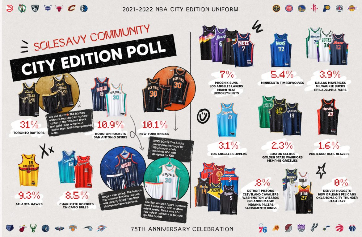
Our community was really rocking with Toronto, Houston, San Antonio, and New York.Â
Thanks to all that participated, keep reading for a little more about each teamâ€s uniforms.
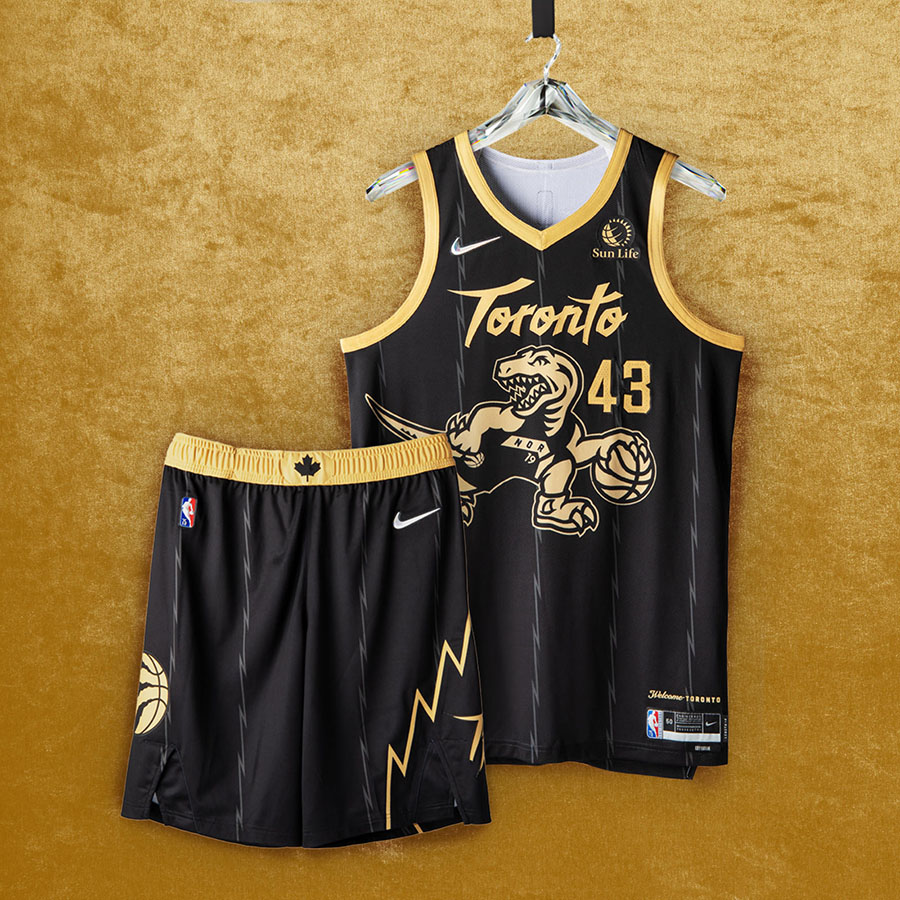
Toronto Raptors
We the North ðŸ The Raptors uniforms feature their cartoon raptor of the â€90s in a black and gold color scheme. A nod to their 2019 championship team. Raptors fans may notice that their signature dino is facing the opposite direction. typically he faces forward; thatâ€s because heâ€s looking back at the history of the franchise.
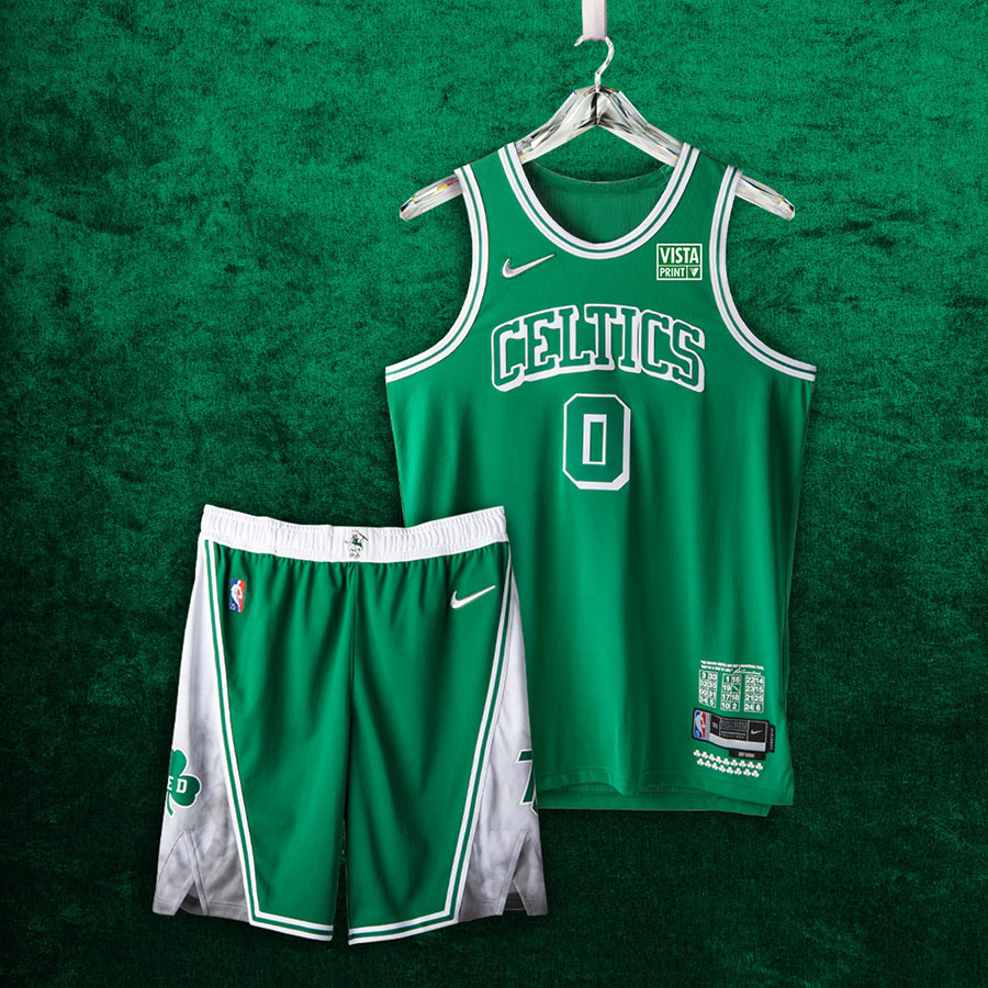
Boston Celtics
The Celtics jerseys remind us why they call themselves Titletown. The anthem detailing at the bottom of the jersey honors each of their 17 titles and every retired number. Their shorts feature two shamrocks, one for their 75th anniversary (the Celtics are one of two teams to call the same city home for every year of the NBA) and the other for Celtics legend Red Auerbach. The uniforms also feature his famed statement: “The Boston Celtics are not a basketball team, theyâ€re a way of life.â€
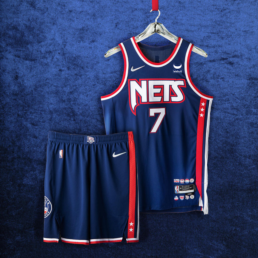
Brooklyn Nets
Brooklyn! Brooklyn! The Nets†uniform oozes energy and creativity, much like the city they call home. The argyle side panels respect the Jason Kidd squads that had back-to-back NBA Finals appearances, while the patch on the shorts is a throwback to their ABA roots (shoutout to Dr. J).
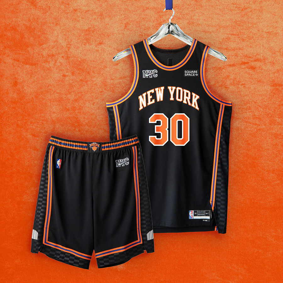
New York Knicks
BING! BONG! The Knicks jersey pays homage to Madison Square Gardenâ€s most iconic moments. Which has been home to some of the gameâ€s most memorable performances; thereâ€s a reason they call it the Mecca. The uniforms were also designed by the prestigious Kith team.
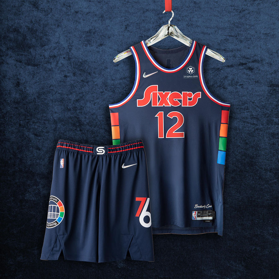
Philadelphia 76ers
Trust the process ðŸðŸ¾ Phillyâ€s uniforms celebrate the team four decades in the Philadelphia Spectrum Arena, the home to Hall of Famers, MVPs, and the â€83 NBA Champions. The arenaâ€s logos are on the shorts, and its signature multicolor pattern runs along the sides of the jerseys.
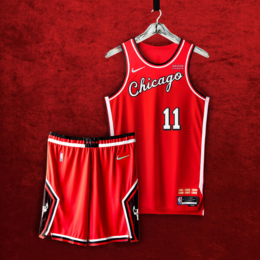
Chicago Bulls
Da Bulls 🂠Chicago is paying homage to their most dominant era when Michael Jeffrey Jordan donned the black and red. The cursive font across the chest is a nod to MJâ€s â€84 rookie season, and the black pinstripes on the shorts praise those 91-93 and 96-98 three-peats.
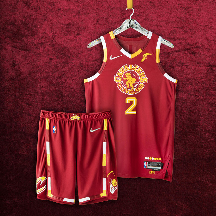
Cleveland Cavaliers
Cleveland is paying respect to their entire franchiseâ€s history with their uniforms. The center logo on the jersey features the teamâ€s Swordsman logo from the â€70s. One leg of the shorts features the “CAVS†logo from the Mark Price era, and the other leg features the logo from their historic â€16 championship team.
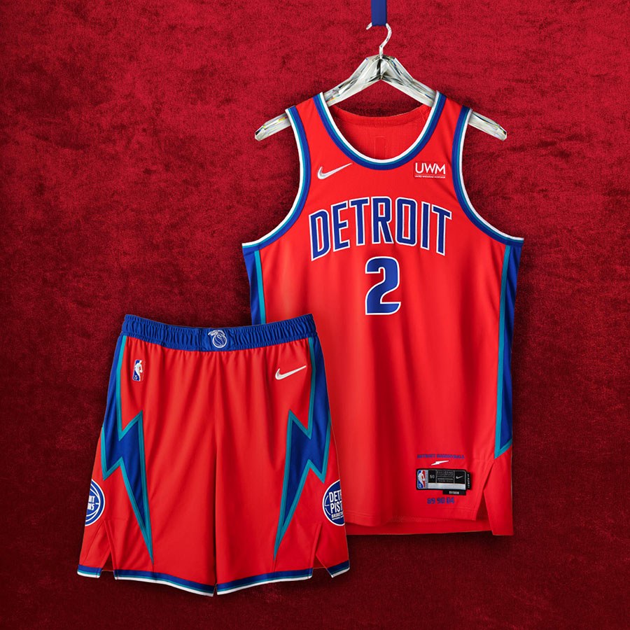
Detroit Pistons
Bad Boys for life 😎 Teal and blue side panels are a nod to Detroitâ€s â€90s squads: color-blocking on the waistband is a remix of the teamâ€s classic flaming horse logo. The jerseyâ€s anthem features the teamâ€s pregame cry, “Detroit Basketball,†and shoutouts their three championship teams from ‘89, â€90, and â€04.
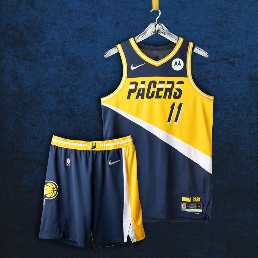
Indiana Pacers
In 49 states, itâ€s just basketball 🌽 The Pacers went all-in on honoring their roots with their jerseys. The logo features elements from their original â€71 logo, along with accents from the â€80s and â€90s. Legendary announcer Bobby†Slick†Leonardâ€s signature call ‘Boom Baby†graces the bottom of the jersey.Â
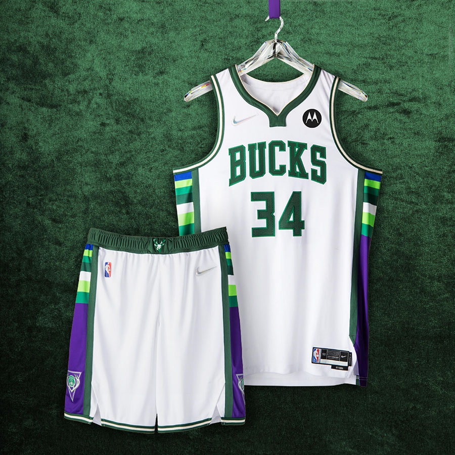
Milwaukee Bucks
Fear the deer 🦌 The defending champs honor their storied past with Lake Michigan blue striping (a nod to their early days), side panels from â€01, and the neckline from the â€10s.
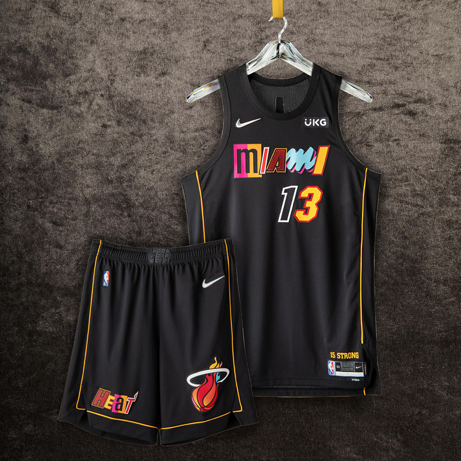
Miami Heat
KABOOM 💥 Miami really went in with these mashup-style uniforms. The typography is a collage from the franchiseâ€s eight most iconic uniforms. The thin gold trim around the uniforms is a nod to the yellow ropes brought out just before Ray Allen hit the “The Shot†in the â€13 Finals (petty, I love it).Â
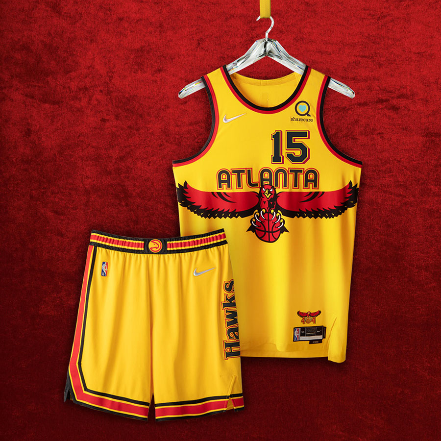
Atlanta Hawks
Peace up, A-town down ✌🾠Hotlanta is bringing back their signature â€90s logo. That red hot hawk is joined by the font from their debut â€68 unis, the back numbering, and vertical ‘Hawks†wordmark of the â€80s.
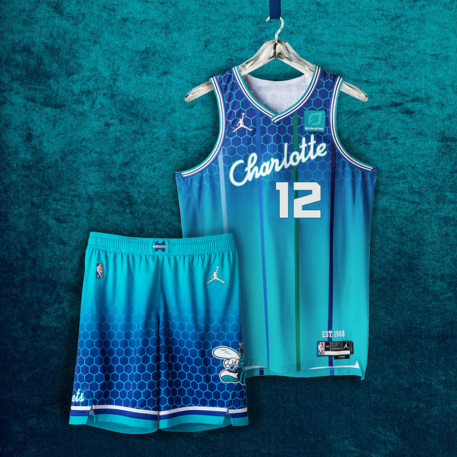
Charlotte Hornets
Buzz City ðŸ Hornets making history by adding the ‘Charlotte†script to a jersey for the first time. Pinstripes make a glorious return (the Hornets were the first team in NBA history to wear them), as does the original Hugo logo.Â
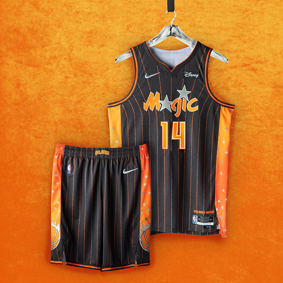
Orlando Magic
The Magic chose orange and anthracite to celebrate the groves that helped build Orlandoâ€s economy. “Why not us?†and “Why not now?â€, the teamâ€s rally cry in the â€90s, is featured as pinstripes on the uni.
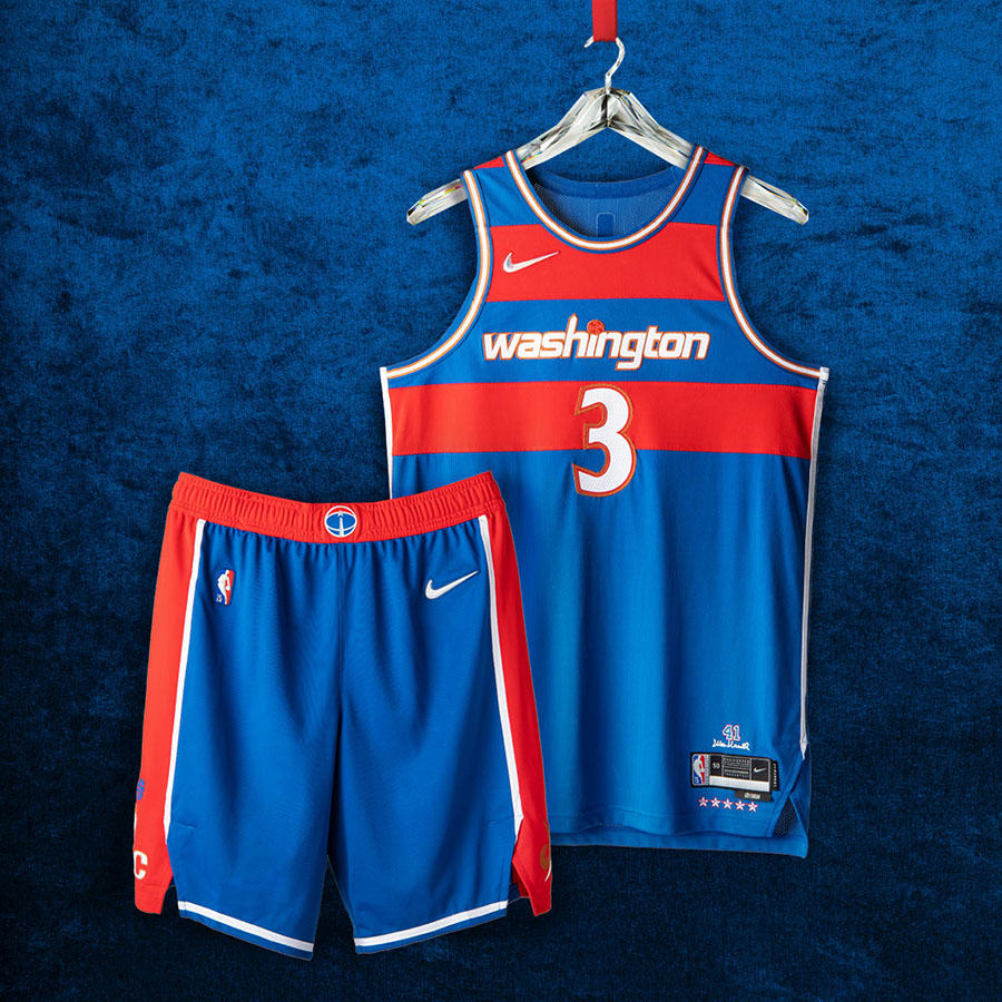
Washington Wizards
This uniform is reminiscent of the teamâ€s early days as the Bullets. Wes Unseldâ€s mark on Washington is undeniable (â€68 MVP and Rookie of the Year), thatâ€s why the team chose to honor him with their anthem patch, which features Unseldâ€s autograph, uniform number, and five all-star appearances.
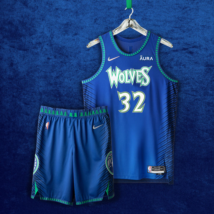
Minnesota Timberwolves
Wolfpack in da house 🺠The blue, green, white color scheme and pine trees return for the Timberwolves, an homage to the franchiseâ€s roots. The script and numbering may look familiar, as theyâ€re the same as the Kevin Garnett squads that dominated the â€00s.
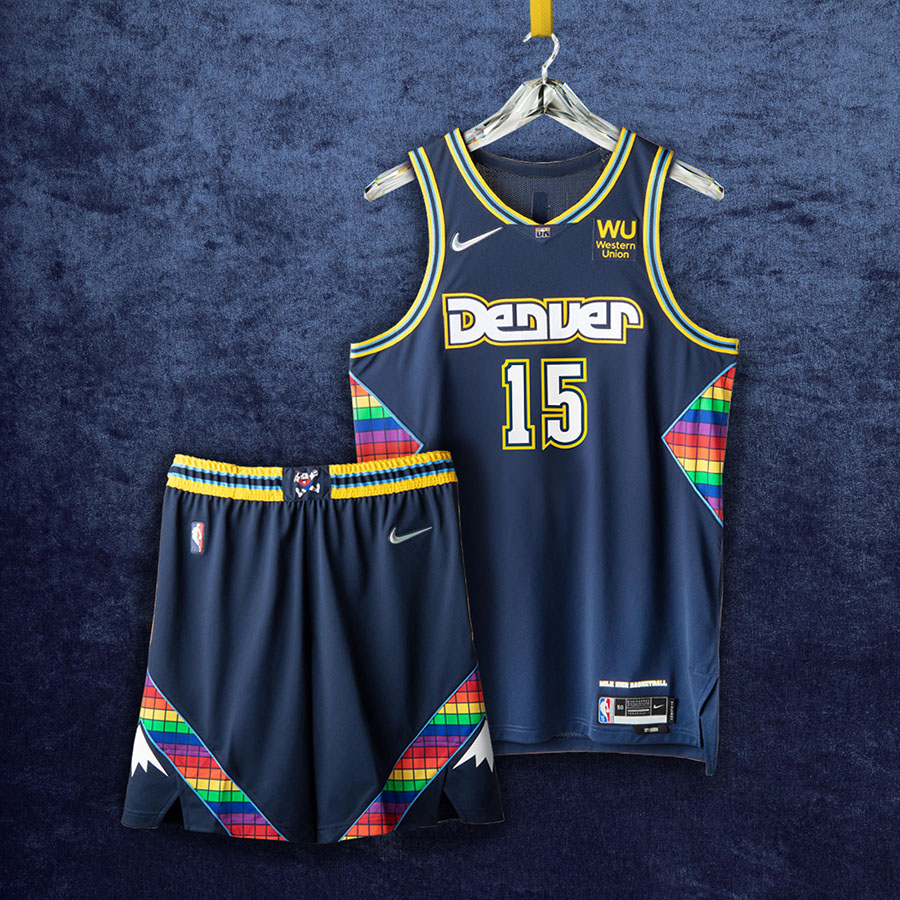
Denver Nuggets
Mile High City 🗻 The lettering across the front is an homage to the Alex English era. At the same time, the borders of the uniforms are a tribute to the â€94 Dikembe Mutombo squad that upset the Seattle Supersonics in the playoffs. The digitized rainbow pattern and Rocky Mountain landscape were chosen as both have represented the franchise for three decades.
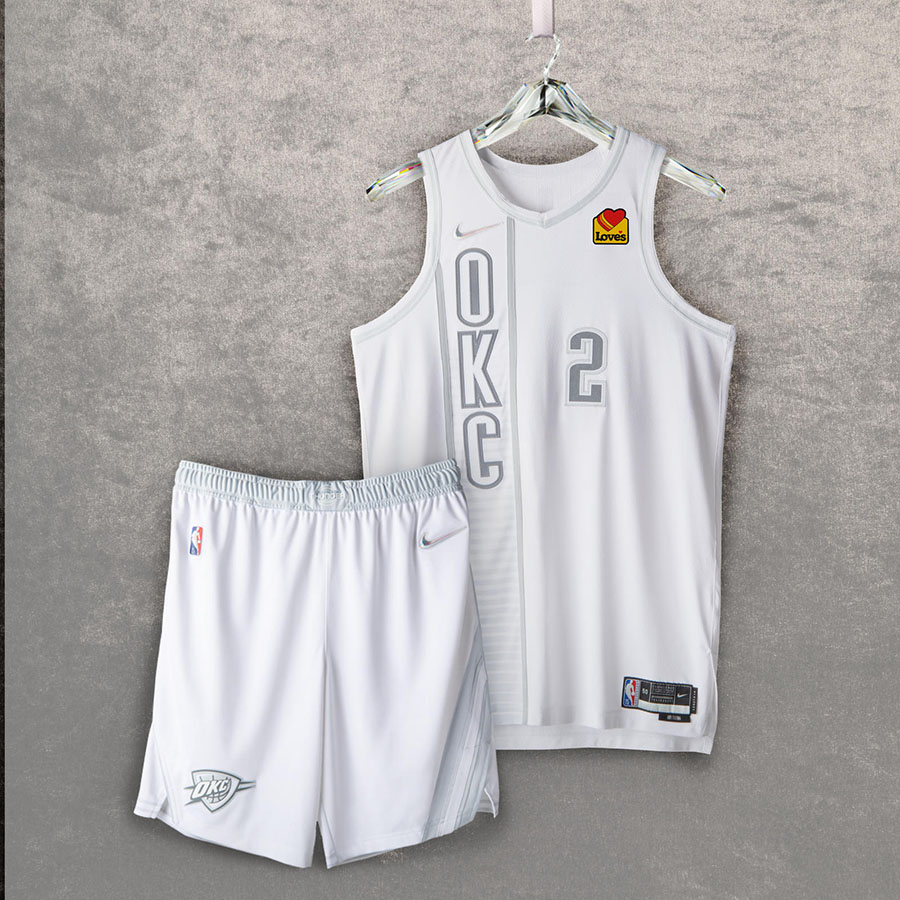
Oklahoma City Thunder
The Thunder are paying tribute to short history (shouldâ€ve paid homage to the Sonics, but I digress). The Navy inspired the vertical lettering alternates worn during Kevin Durantâ€s MVP season, while the horizontal stripes resemble those Russell Westbrook and Paul George donned during their time together. The logo on the shorts is from the teamâ€s inaugural Summer League uniforms.
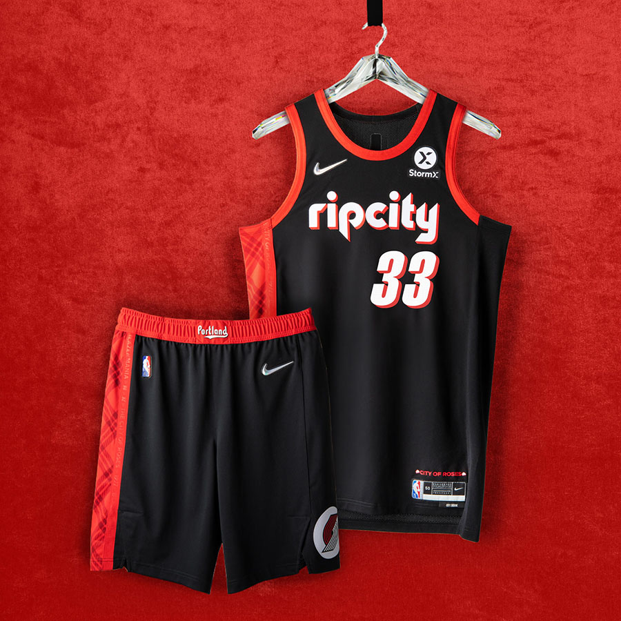
Portland Trail Blazers
Rip City 🗺 The Trail Blazers are honoring their best days with these unis. Players†names are written in the same script from the â€77 Bill Walton-led team, and the typography on the front is a nod to Clyde Drexlerâ€s â€90s squads. The plaid and ‘Blazermania†featured pay tribute to their loyal fanbase.Â
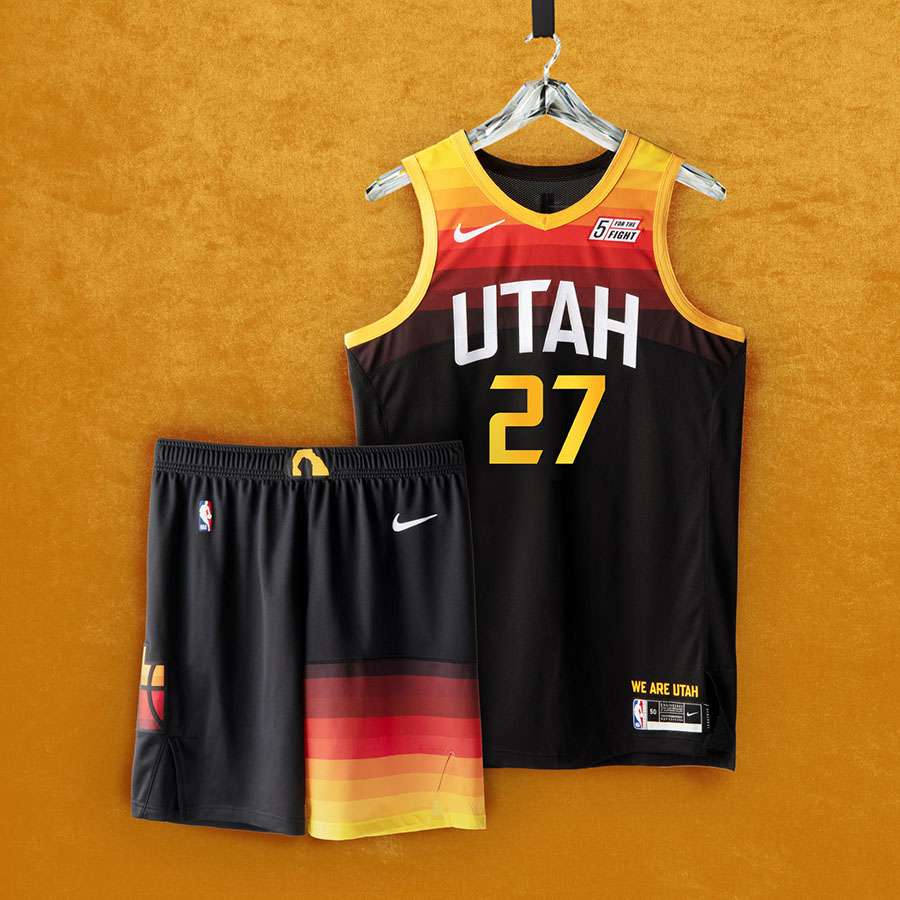
Utah Jazz
Utah struck gold with their city edition uniforms last season. So much so that theyâ€re running them back.
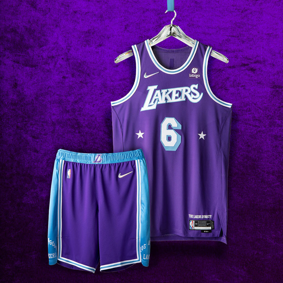
Los Angeles Lakers
17 Championships 🆠The Lakers mark on the NBA goes without saying. Their signature purple (the teamâ€s primary color since the ‘60s) is the base for these unis. Itâ€s complemented by stars (a tribute to the Minneapolis Lakers), the “L†logo from their 00-02 three-peat, and Baby Blue from their original championship squads.
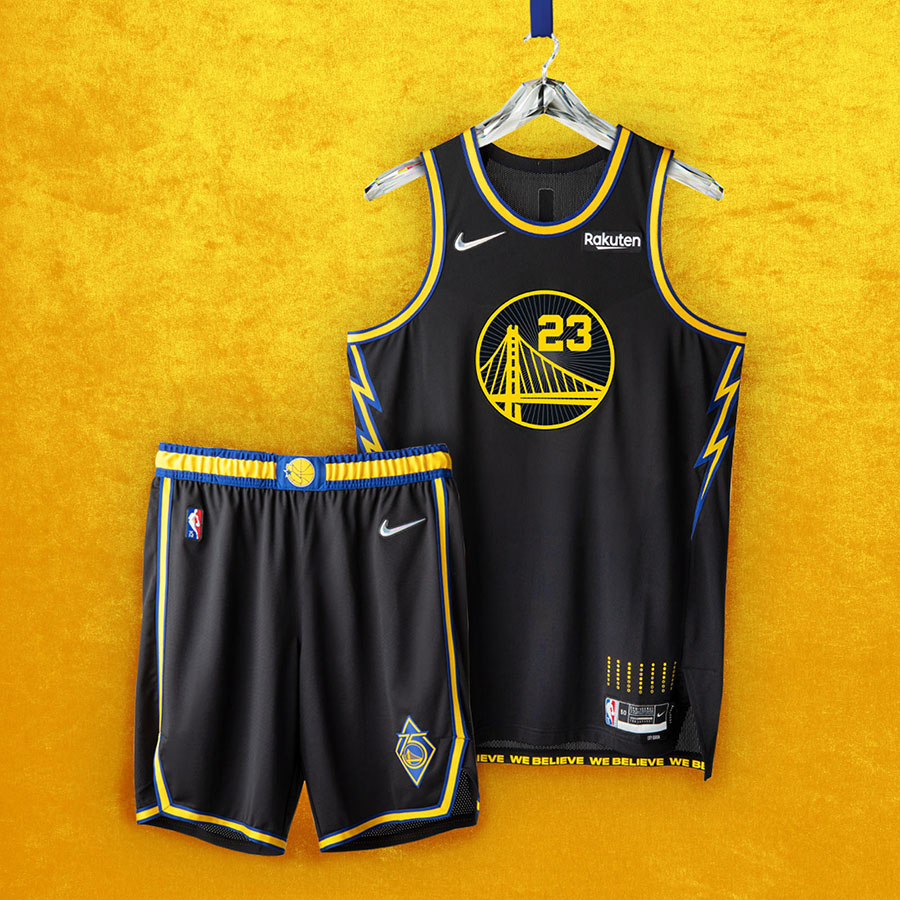
Golden State Warriors
The Town 🌳 San Francisco may be the Warriors home now, but this uniform is directly inspired by the teamâ€s 40+ years in Oakland. The lightning bolts on the side panels are a tribute to their late â€00s squads. In the league from the start, the Warriors shorts feature two logos – a 75th-anniversary logo and one celebrating their iconic ‘We Believe†team.
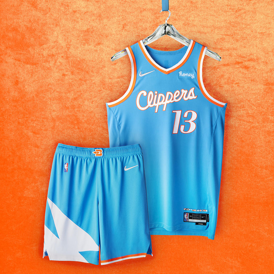
Los Angeles Clippers
Clips opted for Pacific Blue to pay homage to their former days as the Buffalo Braves and San Diego Clippers. The jerseyâ€s numbering and taping are a tribute to their â€84 uniforms, their inaugural season in LA.
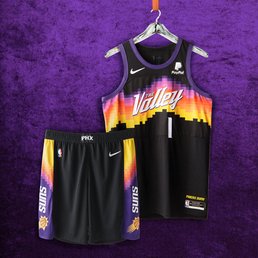
Phoenix Suns
Suns in 4 â˜€ï¸ Why mess with perfection? Much like the Utah Jazz, the Suns are running back last yearâ€s City Edition uniforms.
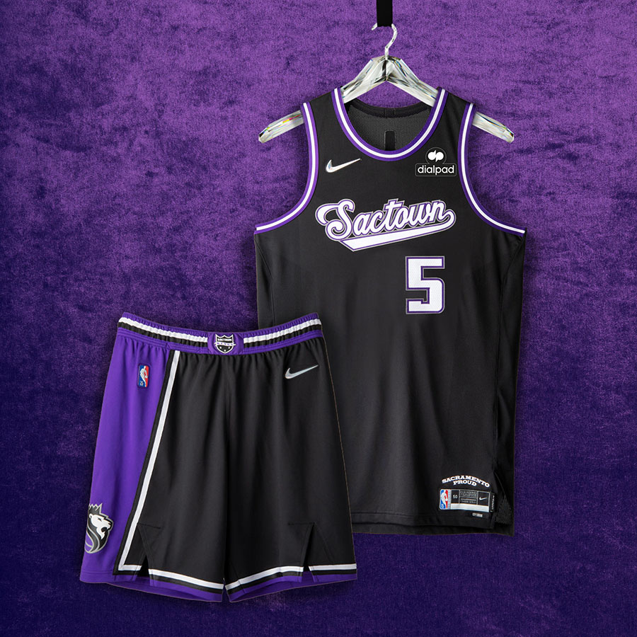
Sacramento Kings
Sactown 👑 The Kings chose black to transport fans back to the Peja Stojakovic where the team was ripâ€n and runâ€n up the court, providing highlight-reel moments nightly. Their script is deeply rooted in the franchiseâ€s history carrying through their previous homes of Rochester and Kansas City.
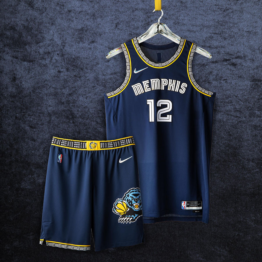
Memphis Grizzlies
Grit & Grind 🧸 Memphis chose to honor their franchise by sticking with its signature Midnight Blue and Grizzlies Gold hues. Bear claw accents on the jersey are from the teamâ€s inaugural season in Vancouver, while the shorts feature the bear logo from the Pau Gasol era. The uniforms†asymmetrical design represents Memphis†geography.
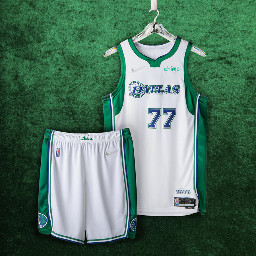
Dallas Mavericks
Loyalty is key 🔠The Mavs unis feature the Dallas skyline and the classic Cowboy hat worn by the “D†in their wordmark for the first time. On the hip of the Mavs unis, youâ€ll notice a tip of the hat thatâ€s for their fans: Mavs Fans for Life.
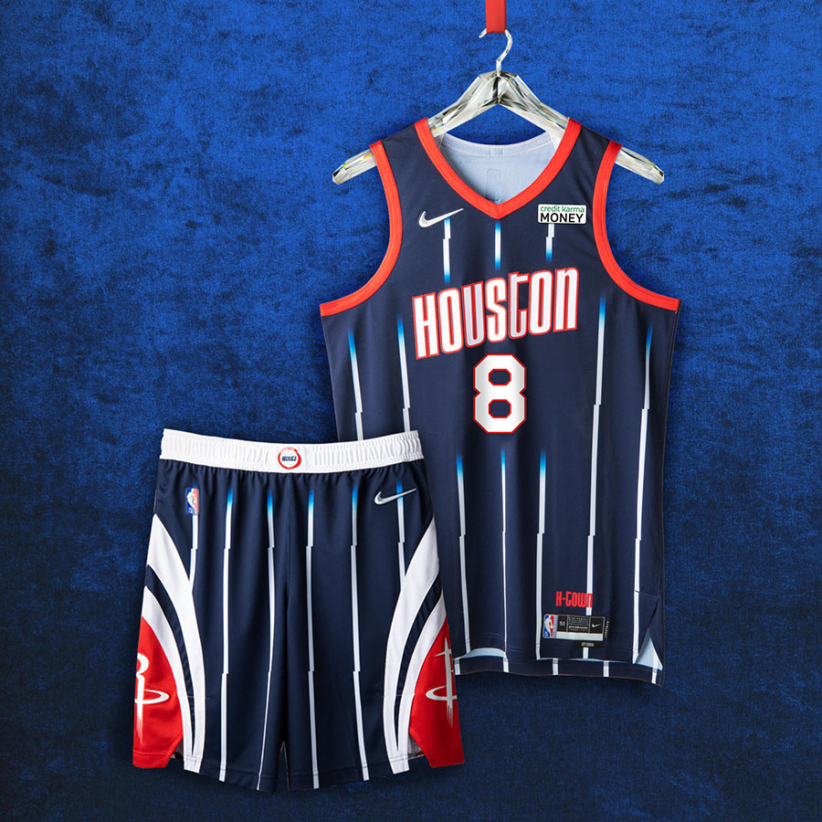
Houston Rockets
Rings > Everything 💠The font on Houstonâ€s uniform was directly lifted from their championship-era road jerseys. The logos on the shorts are from the â€00s where the Rockets received a revitalization thanks to the arrival of Yao Ming.
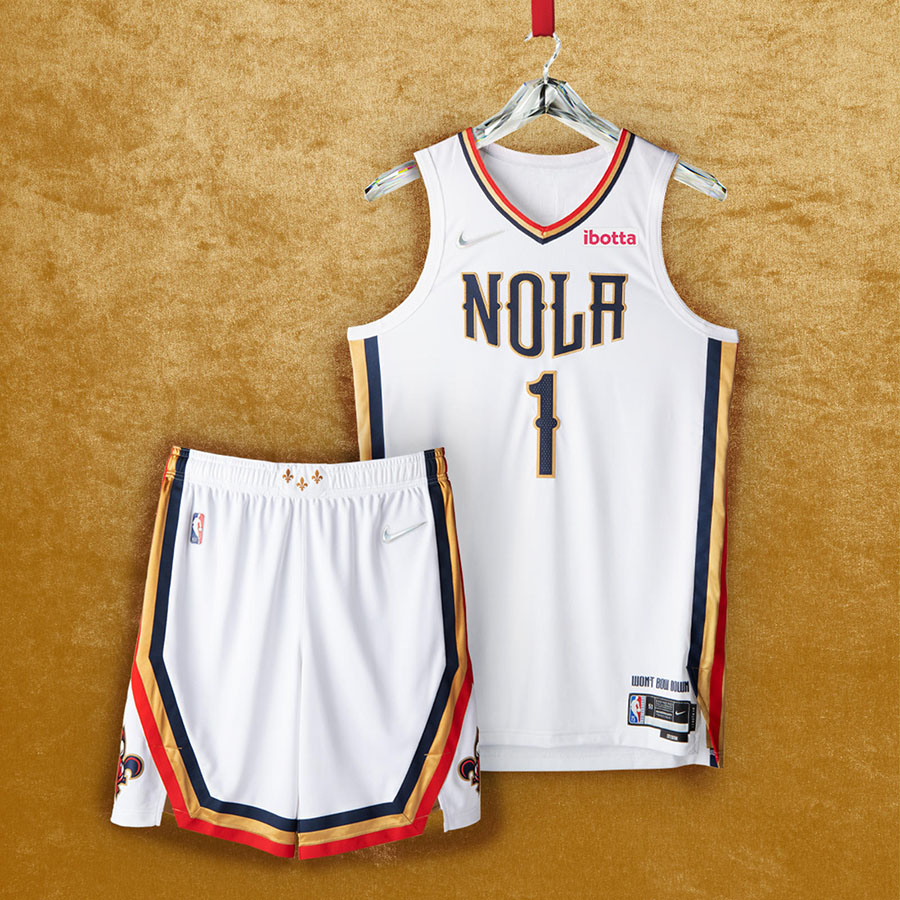
New Orleans Pelicans
City of Saints âšœï¸ The Pelicans unis play to their cityâ€s vibrance. Big, bold striping, ‘NOLA†emblem, iconic fleurs-de-lis on the belt buckle, and the cityâ€s motto: ‘Wonâ€t Bow Down.â€
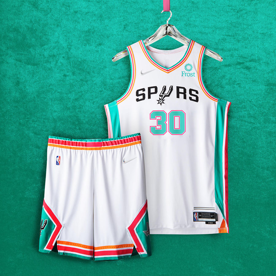
San Antonio Spurs
Let the party begin 🪅 The San Antonio Spurs continue their Fiesta story with a clean white jersey. Paying respect to their â€70s and â€80s squads, the shorts feature the classic bott-spur logo. This is one of a select few uniforms to feature an ABA badge.