*OPINION*
Today Kith officially launched their brand new Loyalty Program via the Kith app – achieving the new g̶o̶l̶d̶ Vitality standard for how companies win customer’s dollars. In a time when many stores are forced to discount nearly everything that comes through their doors, Kith has people chomping at the bit to shop and up their status.
The program is separated into three tiers, each with it’s own set of perks and benefits. Not unlike every other loyalty program, you need to make purchases in order to add points to your account, and as your points add up, you rise the ranks to reach new tiered goals. But that’s just about the only thing traditional about this points program.

In very Kith-like fashion, they went above and beyond to ensure no stone was unturned. They compiled customers’ entire 12 year purchase history; including in-store, in-app, and online – no one starts from zero. They’ve promised that points will never expire, and you’ll never lose your tiered ranking – because there’s nothing worse than a points program that forces you to keep up an insane spend to maintain your status (*cough Aeroplan). Purchasing in-line Kith product and Kith collaborations will score you double the points (pushing people to indulge in product that yields a higher margin), and customers can merge two accounts/emails together to consolidate their points in one place – because, as Andy Oliver noted – “we know people change emails over the course of 12 years.”
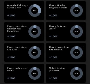
Like other points programs, you can get some freebie points by setting up your account, adding an address, etc – but Kith wants you in-store and in the app often; which is where Achievements come in. Make three in-store purchases? Extra points. Open the app seven days in a row? Extra points. Purchasing is one thing, but incentivizing your customers to engage with your entire ecosystem is how you create a community. These Achievements will also refresh annually, maintaining a consistent cycle of engagement from Kith fans – love it.

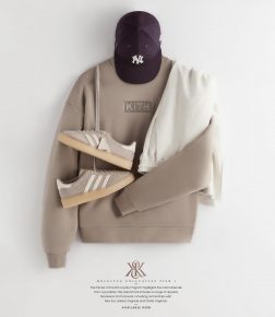
The real nitty gritty of the program comes by way of the perks and benefits within each tier; product being the main incentivizer. Kith isn’t just sending you a “thank you” button if you spend ~$5,000 at their store, they’re granting you access to limited edition product. In a world where sneakers and hype releases can normally only be acquired with lots of luck or lots of money; this creates a situation where access to limited edition product can be gained only through loyalty. Not only that, but (so far) it’s product people want. If the first release is any indication, these Loyalty collections will contain collaborations that would otherwise sell-out when released to the masses. Kith isn’t afraid of alienating a portion of their audience by excluding them from certain releases because they’re familiar enough with their customer to know it’ll just make them want to raise their status so they can get in on the next one. Throw in the promise of “Vault Access”, and Vitality is a place that everyone will want to be.

The middle tier, Elevate, is another subtle stroke of marketing genius. The added perks between tier 1 and tier 2 are minimal, but the difference between tier 2 and tier 3 is substantial. This is the old “psychology of movie theatre popcorn pricing” tactic, and it’s executed perfectly. Why get a size medium when a large is only 19 cents more? Incentivize your customer to go all-in by making an in-between space that doesn’t really make sense to exist in. Now, as I sit here in my Elevate status, I’m counting the releases until I can reach Vitality.Â

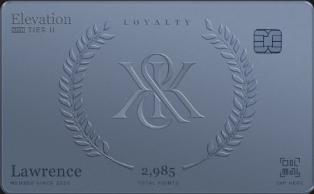
Finally, an often overlooked, but incredibly important part of all of this is the moment Kith has created. They could have simply sent an email or pushed a new update on their app; but they managed to find a way to get customers excited, rejuvenated, and rallying behind the new perk. There was a very Steve Jobs-like feel to having Ronnie Fieg break down the program, and introduce the first Loyalty Collection via a series of social media posts. To top it all off, the cards (while digital) feature your status, name, and points total, and it’s just downright cool looking – making for a sharable piece of content that customers can flaunt on their socials. Making for a UGC-cherry atop the cake of what’s already a very successful launch.

The craziest part about this entire thing is that Kith didn’t need this. With a release (almost) every Monday, and collaborations with whoever they want – they don’t have an issue being sticky with their customers. They didn’t choose to elevate their customer experience out of necessity – which is why everything feels so authentic and why they didn’t skimp on the little things. Kudos to the team at Kith for adding yet another notch to their championship belt, and proving why they deserved back to back FN Retailer of the Year awards, and making a real case for a three-peat.


